ASPM Operational Performance Review
Contents |
Overview
ASPM Operational Performance Review Dashboard provides Managers of Tactical Operations (MTOs), Service Area Managers, and individual facility managers the ability to monitor a variety of performance measures on a daily and quarterly basis. All data displayed in the OPR are preliminary. For more information on data update schedules, see ASPM: Data Sources and Currency/Update Cycle.
OPR data can be viewed on the FAA Operations & Performance Data Web site.
Definitions for the OPR can be found at Definitions of Variables.
Dashboard
Initially, the user will select either Daily View, Weekly View, or Quarterly View by clicking on the appropriate blue link on the top of the page:
- The Daily View presents data for the previous day compared to a target or the average for the same day of the week for the previous three years, and graphs by day for the previous three weeks and the same time period in the previous three years, for individual facilities. It is updated daily. The OPR Daily finishes processing at approximately 8:30 AM Eastern Time, and next day data displayed before that time may not be complete.
- The Weekly View presents data for the previous week compared to the average for the same week for the previous three years, and graphs by day for the previous three weeks and the same time period in the previous three years, for individual facilities.
- The Quarterly View presents data for the most recently completed quarter, and graphs by month for the current and previous three fiscal years for individual facilities. The Quarterly View is typically generated after the ASQP file is processed for the last month in the quarter (generally six weeks after the end of the month).
After choosing daily, weekly, or quarterly view, users specify the following selection options appearing at the top of the dashboard:
- Day/Week/Time Period (4th, 3rd, 2nd, and 1st Quarter of FY)
- MTO (All, Northeast, Midwest, Southeast, Southwest, Western)
- Service Area (All, Eastern, Central, Western)
Within a chosen MTO or Service Area, users specify the type of facility for which they want to view data:
- Core Airports
- TRACONs for Core Airports
- Centers
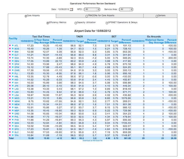
Core Airports
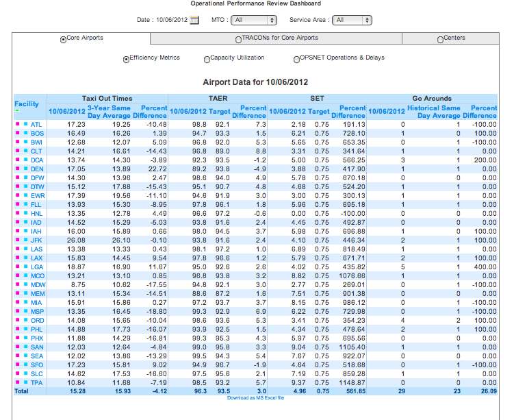
- Efficiency Metrics: Taxi Out Times, TAER, SET, Go Arounds.
- Capacity Utilization: ADC, Peak Periods, Percent Capacity Utilized During Peak Periods, Percent Capacity Utilized 0700-2159 Local.
- OPSNET Operations & Delays: Operations, Delays, Runway Accuracy.
All metrics are subdivided to display 3-year averages or target metrics, and percent differences.
AERO Report (ATO Efficiency Report Online)
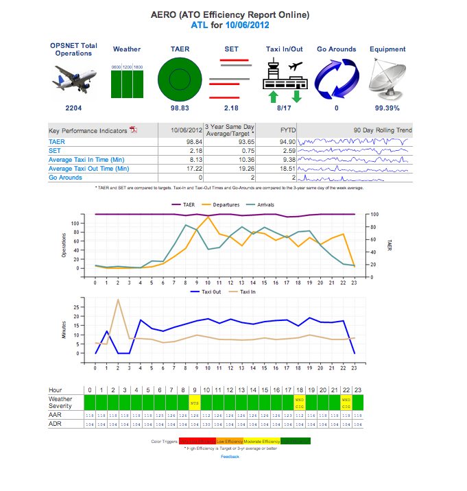
These are the variables displayed in the KPI list for each airport:
- OPSNET Total Operations
- Weather
- TAER
- Spacing Efficiency Tool (SET)
- Average Taxi In Time (Min)
- Average Taxi Out Time (Min)
- Go Arounds
- Equipment (Percent Adjusted Operational Availability)
- Weather Severity
- AAR
- ADR
- ISAN (Infrastructure Service as Needed)
Clicking on TAER, TAXI IN/OUT, SET or Go Arounds in the KPI table will open a window displaying the selected metric by hour. Clicking on any hour on the line graphs will open a window displaying individual flights for that hour.
For more information on the components of the AERO report, see the AERO Quick Guide.
Key Performance Indicators (KPIs)
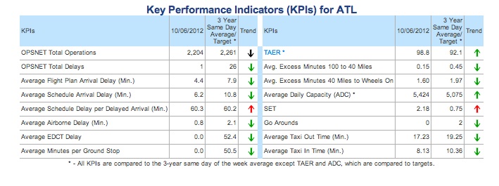
- OPSNET Total Operations
- OPSNET Total Delays
- Average Flight Plan Arrival Delay (Min.)
- Average Schedule Arrival Delay (Min.)
- Average Schedule Delay per Delayed Arrival (Min.)
- Average Airborne Delay (Min.)
- Average EDCT Delay
- Average Minutes per Ground Stop
- TAER*
- Average Excess Minutes 100 to 40 Miles
- Average Excess Minutes 40 Miles to Wheels On
- Average Daily Capacity (ADC)*
- SET
- Go Arounds
- Average Taxi Out Time (Min.)
- Average Taxi In Time (Min.)
*All KPIs are compared to the 3-year average for the same time period (monthly view) OR 3-year average for the same day (daily view) except TAER and ADC, which are compared to Targets.
Graphs
Clicking on the facility's code will lead to a new screen containing information on the selected metrics in graphic form (lines, columns, bars, and areas). Graphs can display data for an individual or multiple fiscal years.
Graphs for Efficiency Metrics
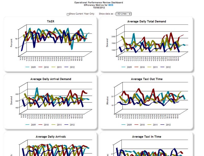
- TAER
- Average Daily Total Demand
- Average Daily Arrival Demand
- Average Taxi Out Time
- Average Daily Arrivals
- Average Taxi In Time
- Average Schedule Arrival Delay (Min.)
- Average Schedule Delay per Delayed Arrival
- Percent On Time Gate Arrivals
- Percent On Time Gate Departures
Graphs for Capacity Utilization
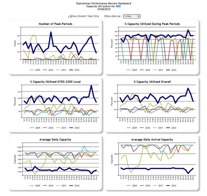
- Number of Peak Periods
- % Capacity Utilized During Peak Periods
- % Capacity Utilized 0700-2200 Local
- % Capacity Utilized Overall
- Average Daily Capacity
- Average Daily Arrival Capacity
Graphs for OPSNET Operations & Delays
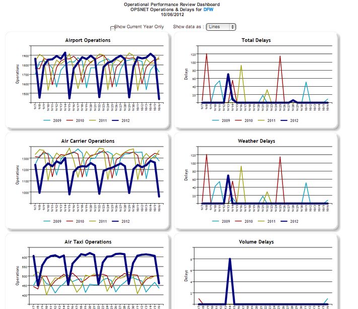
- Airport Operations
- Total Delays
- Air Carrier Operations
- Weather Delays
- Air Taxi Operations
- Volume Delays
- General Aviation Operations
- Equipment Delays
- Military Operations
- Runway Delays
- Accuracy of Runway Configurations
- Other Delays
TRACONs for Core Airports
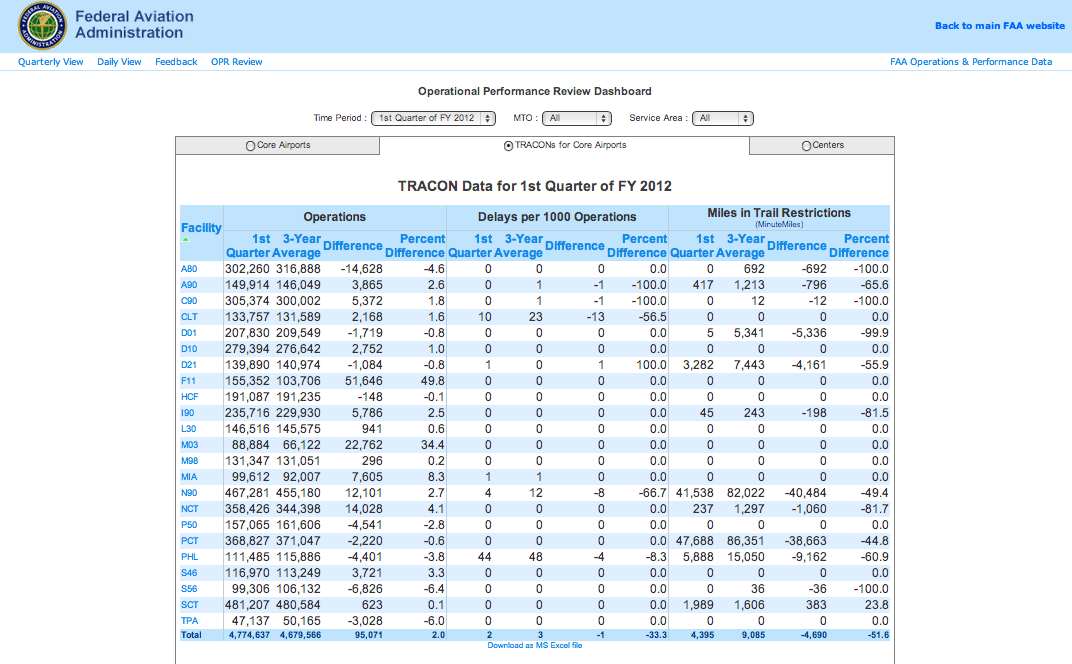
- Operations
- Delays
- Miles in Trail Restrictions (MinuteMiles)
The resulting data table can be sorted by clicking on the column heading for any column in the table.
Once the report is generated, information on individual facilities can be obtained by clicking on the facility code. This will lead to a new screen containing information on the selected metrics in graphic form (lines, columns, bars, and areas). Graphs can display the following data for an individual or multiple fiscal years:
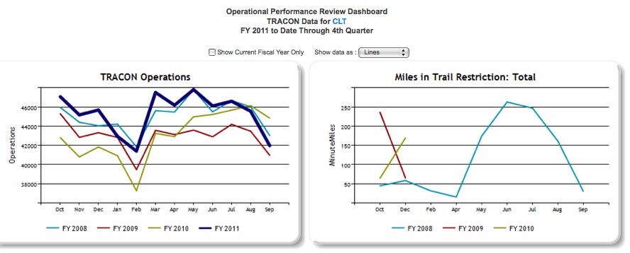
- TRACON Operations
- Miles in Trail Restriction: Total
- Miles in Trail Restriction: Volume
- Miles in Trail Restriction: Weather
- Miles in Trail Restriction: Equipment
- Miles in Trail Restriction: Other
Centers
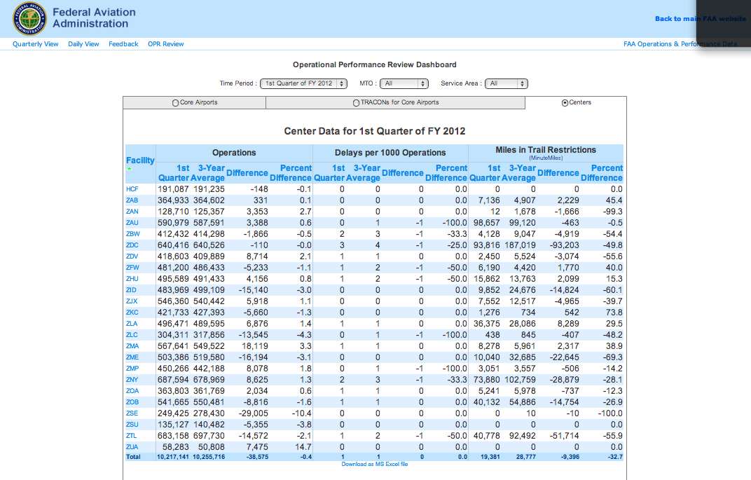
- Operations
- Delays
- Miles in Trail Restrictions (MinuteMiles)
The resulting data table can be sorted by clicking on the column heading for any column in the table.
Once the report is generated, information on individual facilities can be obtained by clicking on the facility code. This will lead to a new screen containing information on the selected metrics in graphic form (lines, columns, bars, and areas). Graphs can display the following data for an individual or multiple fiscal years:
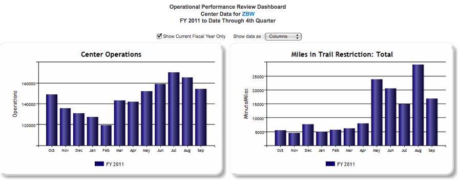
- Center Operations
- Miles in Trail Restriction: Total
- Miles in Trail Restriction: Volume
- Miles in Trail Restriction: Weather
- Miles in Trail Restriction: Equipment
- Miles in Trail Restriction: Other
Definitions of Variables
For more information about these topics, please see Definitions of Variables for this system.

